
How to make pixel art
Most people who try pixel art for the first time open a 256×256 canvas, pick 40 colors and give up an hour later. The trick is the opposite: start smaller than feels reasonable and use fewer colors than feels possible.
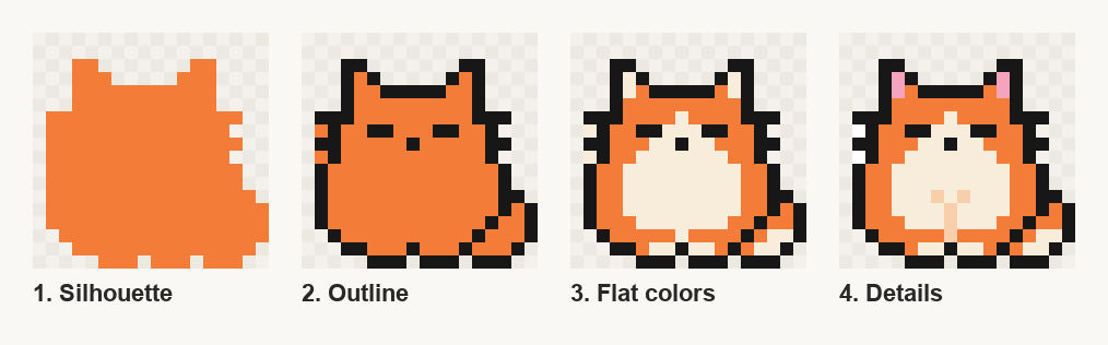
Below is a workflow for small game sprites, shown on an 18×18 cat. It works the same for characters, items and icons.
Open the editor and follow along
1. Pick a tiny canvas
Small canvases are easier, not harder. Every pixel is a clear decision and you finish before you lose motivation.
- 8×8 — icons, tiny items, coins
- 16×16 — classic game characters, tiles
- 24×24 – 32×32 — characters with more detail, portraits
- 64×64 — big sprites, small scenes
If you're unsure, take 16×16. The cat above is 18×18 because its tail needed two more columns.
2. Limit your palette
Pick 4 to 8 colors before you draw a single pixel. A limited palette forces the image to read clearly and keeps colors consistent across sprites.
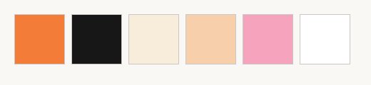
The cat uses six: a near-black outline, the orange body, a cream belly, and three tiny accents (peach, pink, white) that only cover eleven pixels together. If you don't want to build a palette yourself, borrow one from the pixel art palette library: PICO-8 (16 colors), Endesga 32 and Sweetie 16 are popular starting points.
Don't use pure black for outlines on colorful sprites. A very dark neutral (here #171717) looks cleaner, and on soft styles a dark version of the body color looks even better.
3. Block in the silhouette
Fill the whole shape with one color. No outline, no details. You're only checking one thing: is it recognizable as a single flat shape?
If the silhouette doesn't read, no amount of shading will fix it later. Squint at it, or zoom out to 1×. For the cat, the two ear bumps and the tail are what make it read as a cat, so they stick out clearly.
4. Add the outline
Draw the outline on top of the silhouette. Two rules keep it clean:
- Avoid "doubles": in a diagonal line, each step should touch the next only at a corner. An L-shaped clump of three pixels makes the line look thick and jagged.
- Keep steps even: a curve made of steps like 3-2-1-1 looks smooth; 3-1-2-1 looks wobbly.
Inner lines (the eyes, the mouth) come in this step too. On a small sprite a single pixel is a face feature, so place them carefully. Here the eyes are two short dashes and the nose is one pixel.
5. Flat colors
Now fill each area with its base color: body orange, belly cream. Still no shading. This is where you check that the colors work together and that areas are big enough to read.
Small areas (1–2 pixels wide) often become noise. If a stripe or a patch doesn't read at 1×, remove it or make it bigger.
6. Details and shading
Last, add the small things that make it feel alive: pink inside the ears, a hint of paws, a highlight. On a sprite this small, fewer details are better. The cat has no real shading at all, just color areas, and it still reads well as a game icon.
When you do shade bigger sprites:
- Pick one light source (top-left is the classic choice) and stick to it.
- Use 2–3 tones per color: base, shadow, highlight.
- Shift the hue a little, not just the brightness: shadows slightly cooler or more saturated, highlights slightly warmer. It looks far less muddy than plain darker/lighter versions.
7. Export without blur
Pixel art is drawn at 1× and scaled up with nearest-neighbor scaling, in whole numbers (2×, 3×, 4×…). Any smoothing turns crisp pixels into mush:
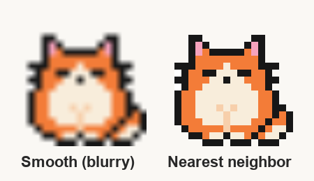
- Save as PNG, never JPG, which adds color noise.
- Scale by whole numbers only. 2.5× makes some pixels wider than others.
- In game engines, turn off texture filtering (Godot: Default Texture Filter = Nearest; Unity: Filter Mode = Point).
Tools
You don't need anything expensive. Aseprite is the standard paid tool, and LibreSprite is a free fork of an older version. Piskel and Lospec's editor run in the browser, and so does the pixel art editor on this site, with palettes, a grid and nearest-neighbor export built in. Any of these will do. The workflow matters more than the tool.
Practice ideas
The fastest way to improve is many small finished sprites, not one big unfinished one. A few to try, each in 16×16 with at most 8 colors:
- A potion bottle (simple shape, good for practicing highlights)
- A slime (silhouette practice)
- A sword (diagonal lines without doubles)
- A cat or a frog (readable face in a few pixels)
- A heart, coin and key set (consistent palette across items)
For more, browse pixel art ideas by theme or start with easy pixel art, and look at how others place single pixels for eyes and highlights.